Creative
Advertising
An integrated branding, content, and advertising engagement across Gepha’s health portfolio – building unified visual systems, social media ecosystems, and digital advertising strategies for Manhaé, Bene Pharm, and Normon under one creative framework.

THE CHALLENGE
Gepha’s health and wellness portfolio included multiple brands operating with separate visual identities, inconsistent social media approaches, and no overarching communication framework. Each brand – Manhaé, Bene Pharm, and Normon – addressed different audience segments and product categories, yet none had a defined visual system or content strategy that matched the credibility expected from health-sector brands. Gepha needed a creative partner who could build distinct identities for each brand while maintaining a cohesive quality standard across the entire portfolio.
STRATEGY
The creative approach treated each brand as an independent identity within a shared quality framework, addressing portfolio-level consistency without flattening individual brand character:
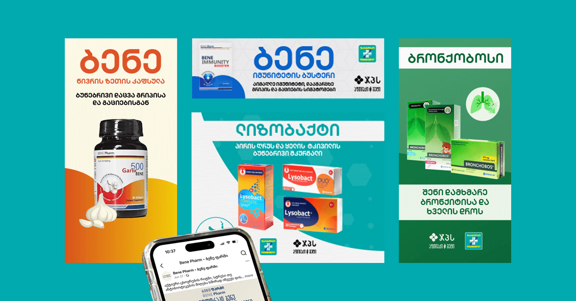
Created a full visual system for Bene Pharm from scratch, including logo design, creative patterns, and brand application guidelines
Refreshed brand visuals and identity patterns for Manhaé and Normon, updating each brand’s aesthetic while preserving existing equity and audience recognition
Defined visual positioning for each brand by establishing distinct tone, mood, and color direction that communicated credibility in health while differentiating between product lines
Built social media content strategies tailored to each brand’s audience on Facebook and Instagram, with graphic templates and motion visuals aligned to platform-specific engagement patterns
Integrated all brand identities into a shared creative production pipeline, allowing Gepha to manage three brands through a single agency relationship without sacrificing individual attention


EXECUTION
Bene Pharm received the most extensive treatment as a new brand identity built from the ground up. The logo design established the visual foundation, followed by a creative pattern system and application guidelines that governed how the brand appeared across packaging, digital ads, and social content. Manhaé and Normon underwent identity refreshes – retaining their established market recognition while updating visual elements to meet current design standards and platform requirements.
Deliverables covered identity, content, and advertising across all three brands:
Deliverable | Description |
Bene Pharm brand identity | Logo design, creative patterns, color system, and visual application guidelines built from scratch for a new health brand |
Manhaé identity refresh | Updated brand visuals, pattern system, and digital asset templates that modernized the existing aesthetic while retaining established audience recognition |
Normon identity refresh | Refreshed visual direction and creative patterns aligned with pharmaceutical-sector credibility standards and updated platform dimensions |
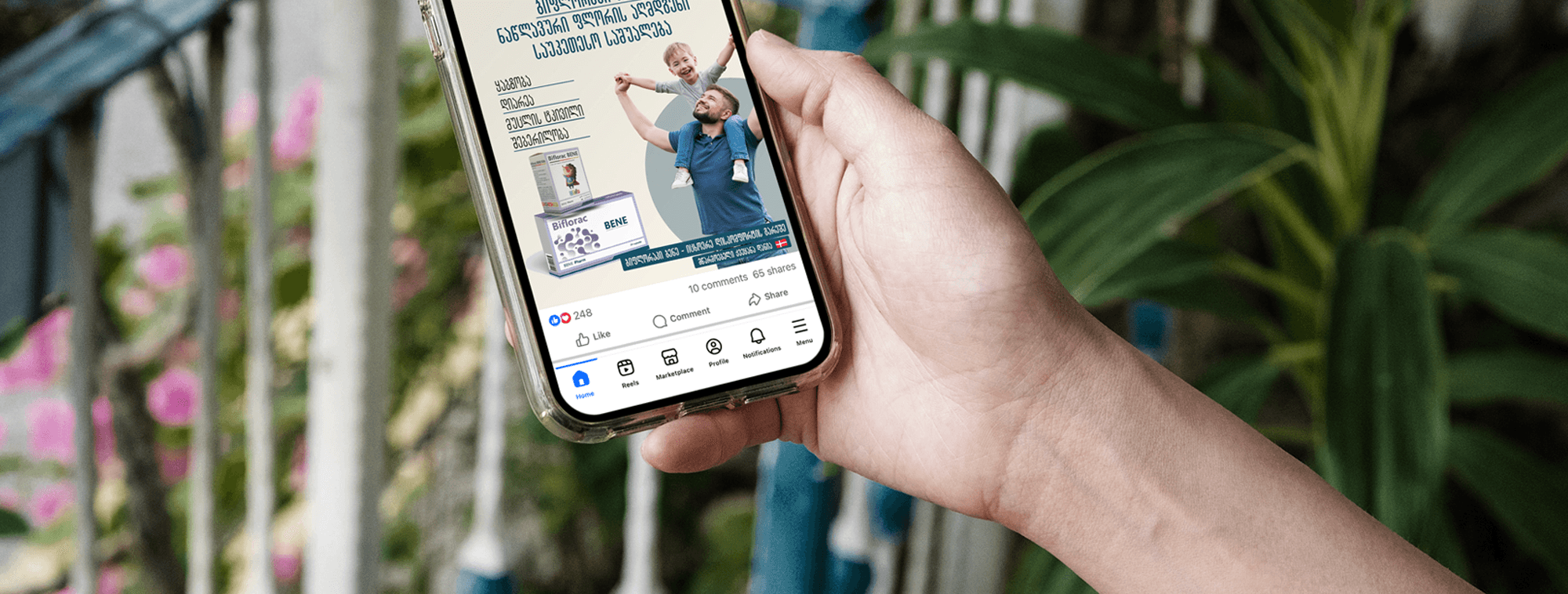
Social media content systems | Brand-specific graphic templates, motion visuals, and content calendars for Facebook and Instagram, with audience-segmented posting strategies per brand |
Digital advertising campaigns | Paid social and display ad creatives produced for each brand, with campaign messaging tailored to product-specific benefits and seasonal health cycles |
Creative direction | Ongoing art direction across the portfolio ensuring that all assets, from social posts to ad banners, maintained visual consistency within each brand and quality parity across the portfolio |
The social media ecosystem required a different content approach for each brand. Manhaé’s audience responded to lifestyle-oriented health content with warm, approachable visuals. Bene Pharm’s positioning called for a more clinical, trust-forward aesthetic. Normon’s content leaned into pharmaceutical authority with product-focused imagery and health education formats. Managing these distinct content voices through a single production pipeline tested the team’s ability to shift creative registers without losing efficiency.
KEY INSIGHT
Running three brand identities through a single creative pipeline with distinct visual positioning per brand grew combined social engagement by 175% – proving that portfolio-level consistency in production quality amplifies each individual brand’s performance rather than diluting it.
