Creative
Advertising
Web Development
A four-year collaboration transforming Arttime’s visual identity and digital communication to reflect the precision and prestige of world-class watchmaking.

THE CHALLENGE
Arttime had built a strong offline reputation as Georgia’s leading retailer of branded watches and the official representative of several international watch houses. Its digital presence, in contrast, did not reflect that authority. Visual communication varied in quality across channels, and the brand lacked a unified identity system.
Arttime needed a creative partner who could bring the same precision to its brand communications that its products demanded.
STRATEGY
The partnership began with foundational brand work and expanded into ongoing brand application and advertising support over four years:
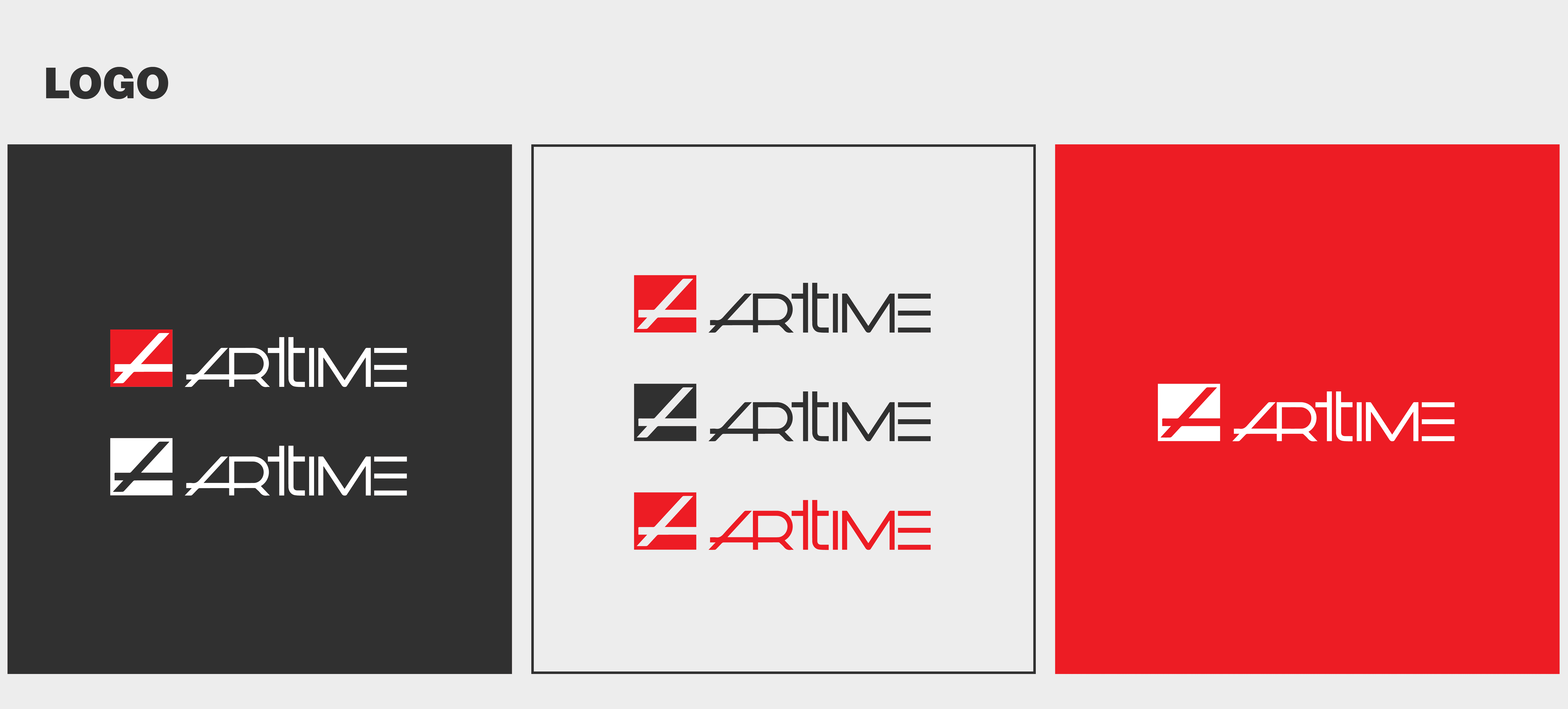
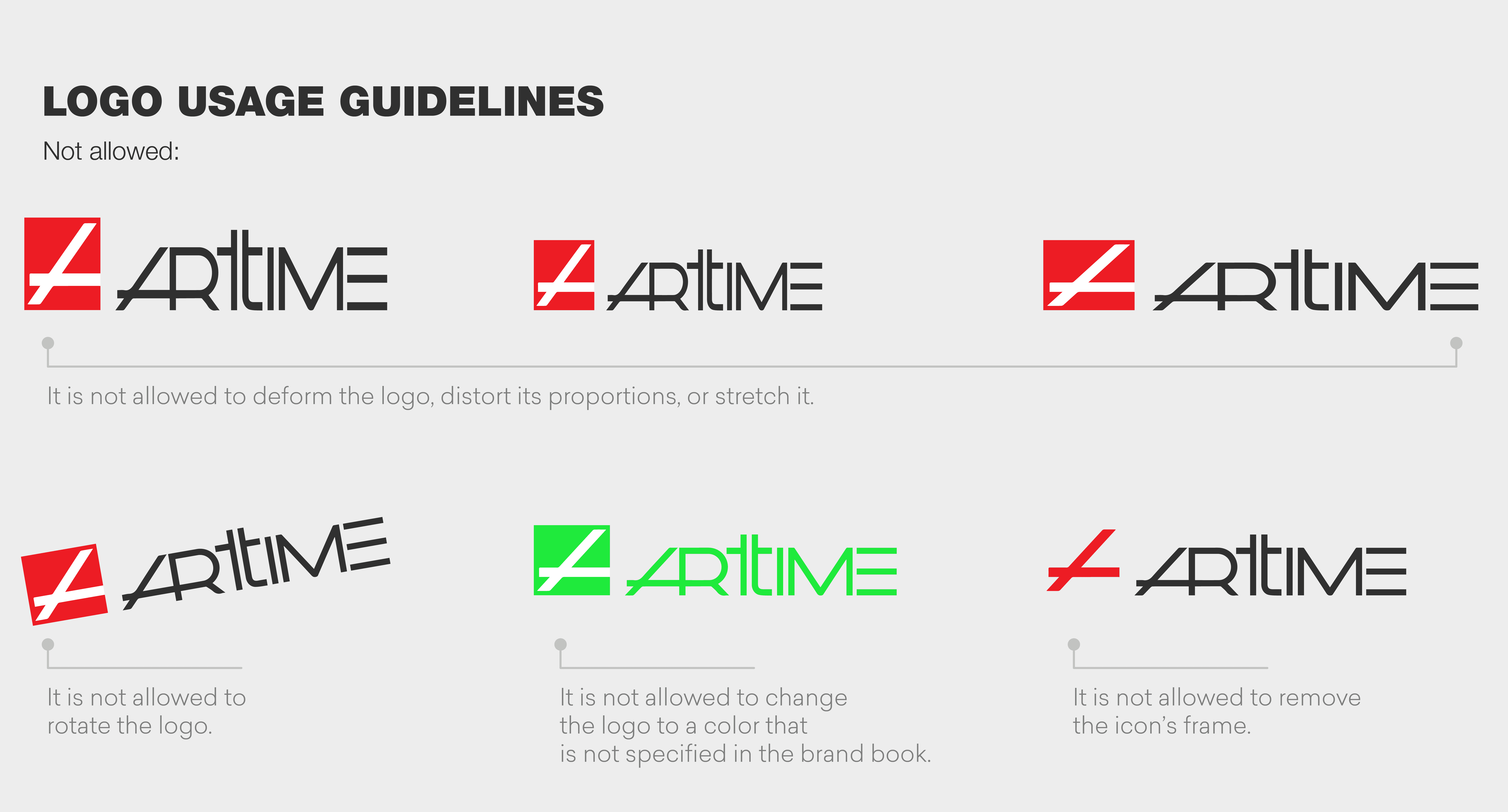
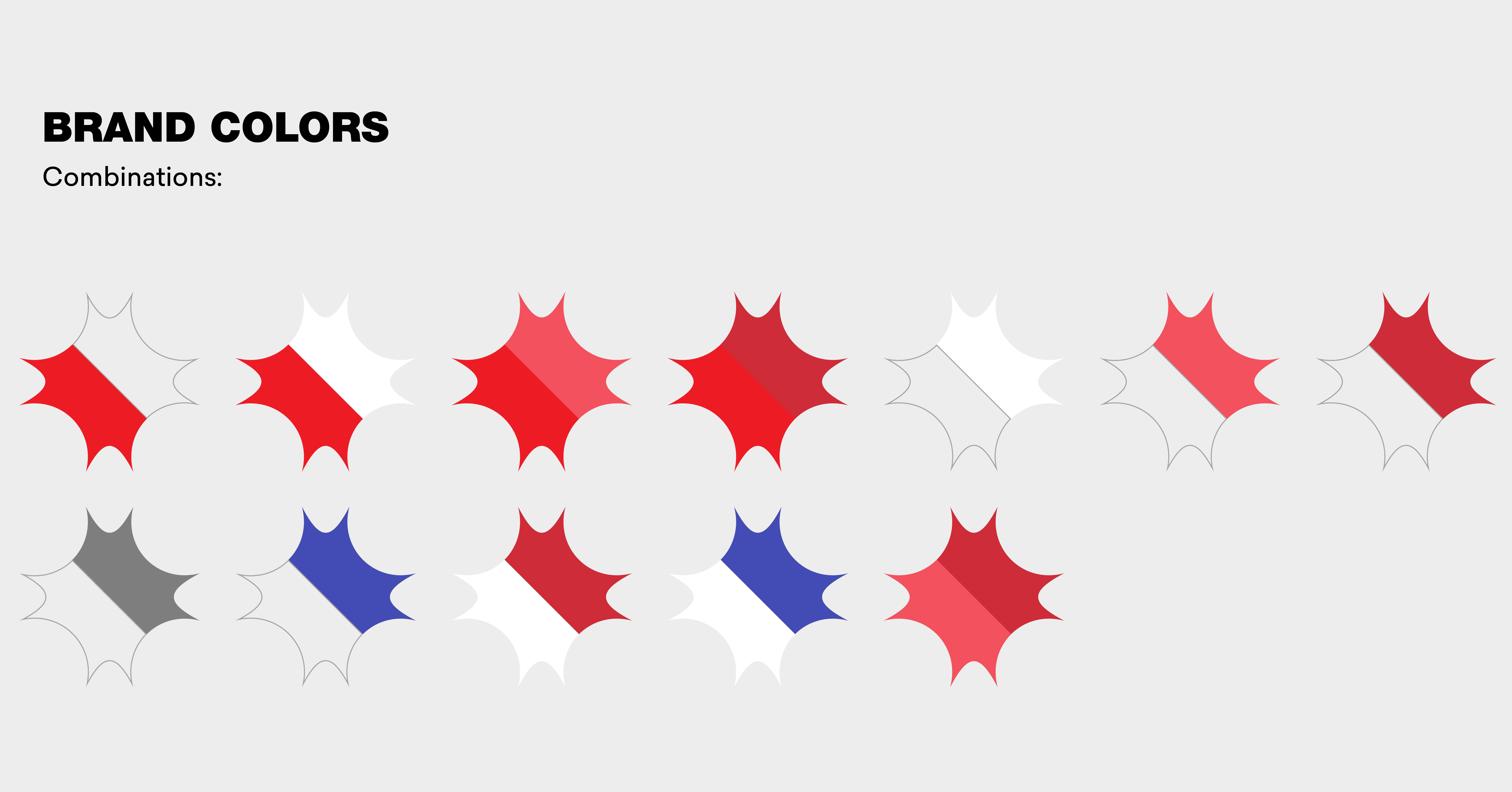
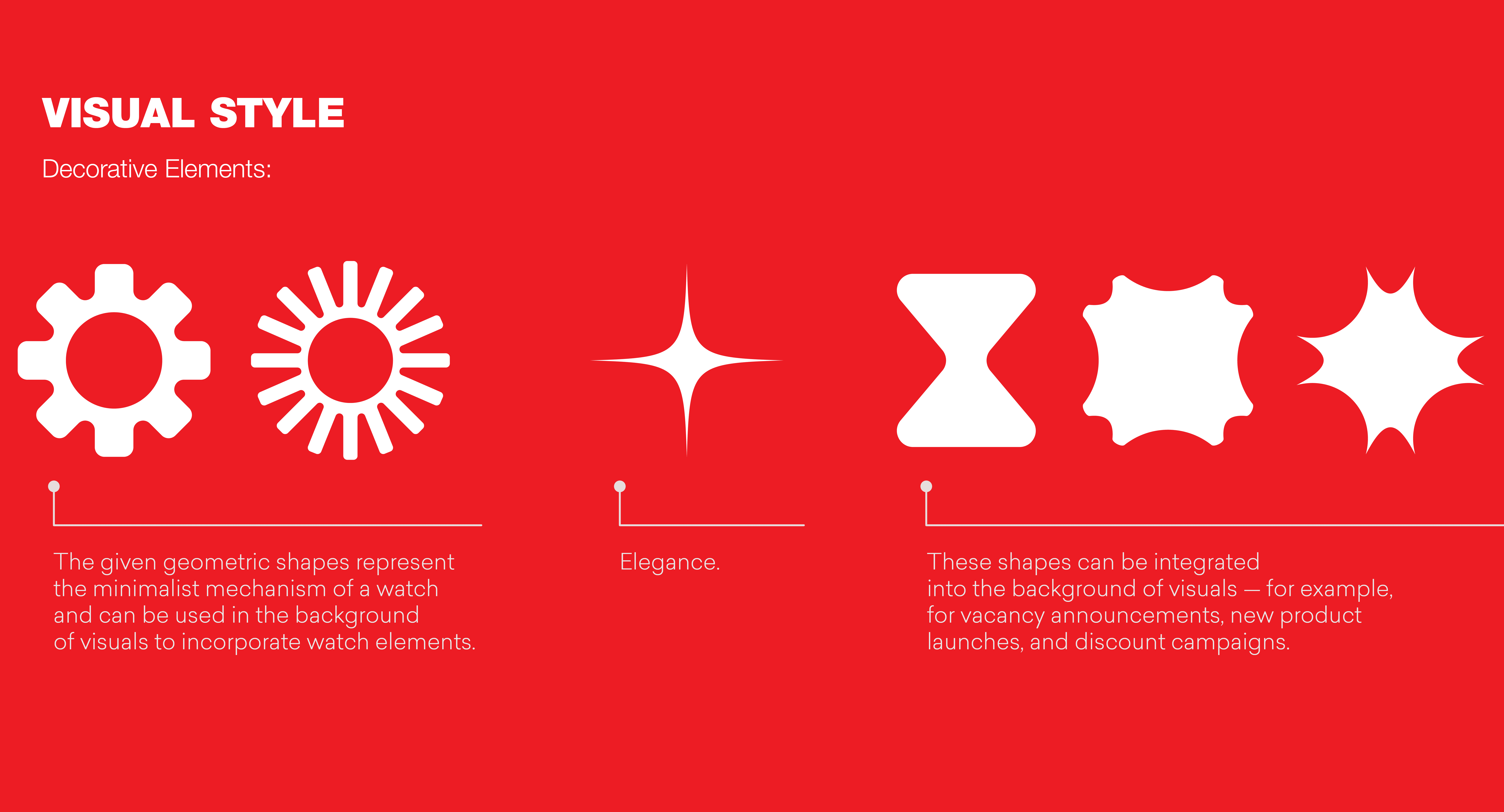
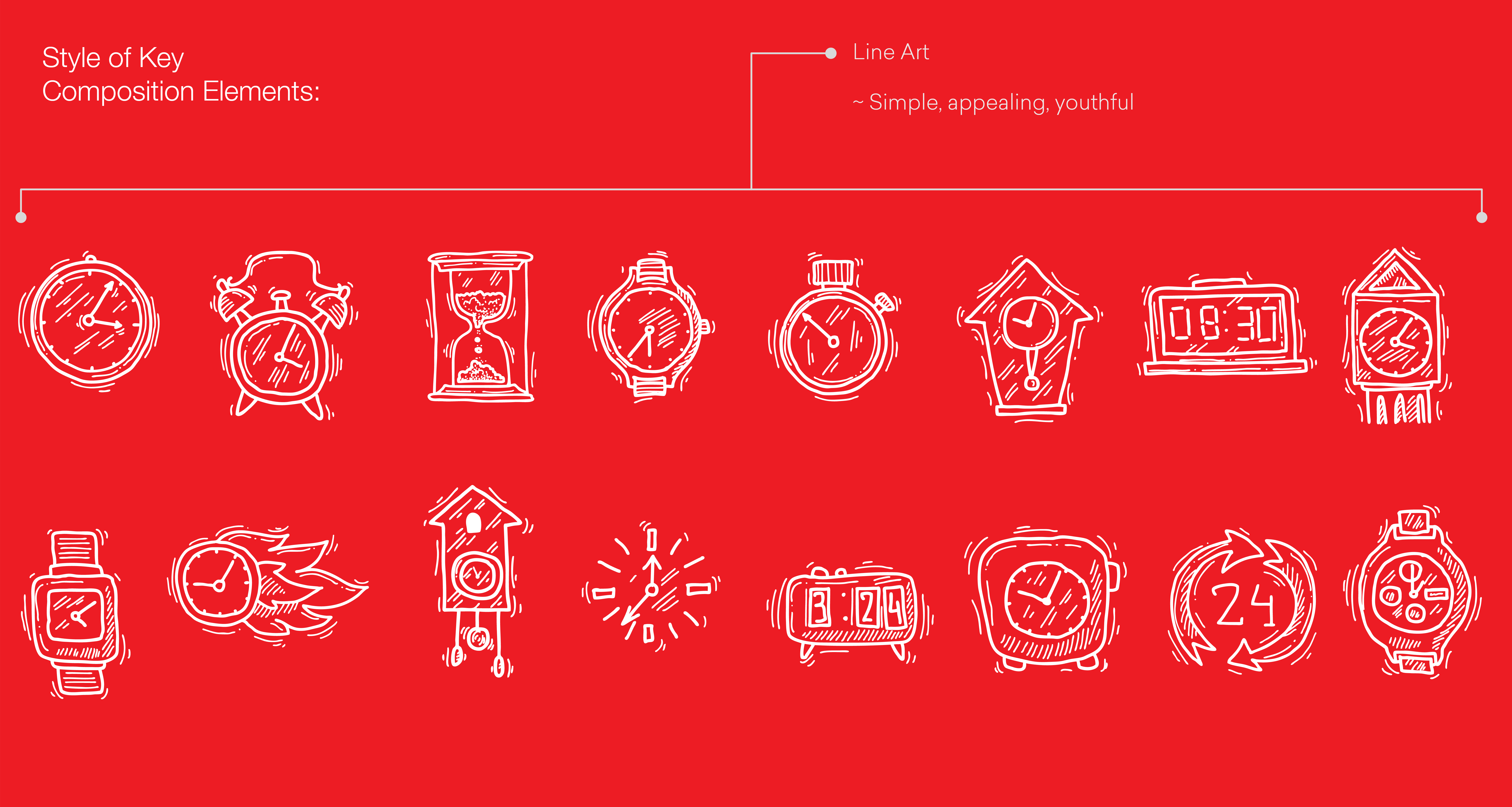
Developed a comprehensive brandbook that established Arttime’s visual rules, tone of voice, and application standards as the reference point for all future communications
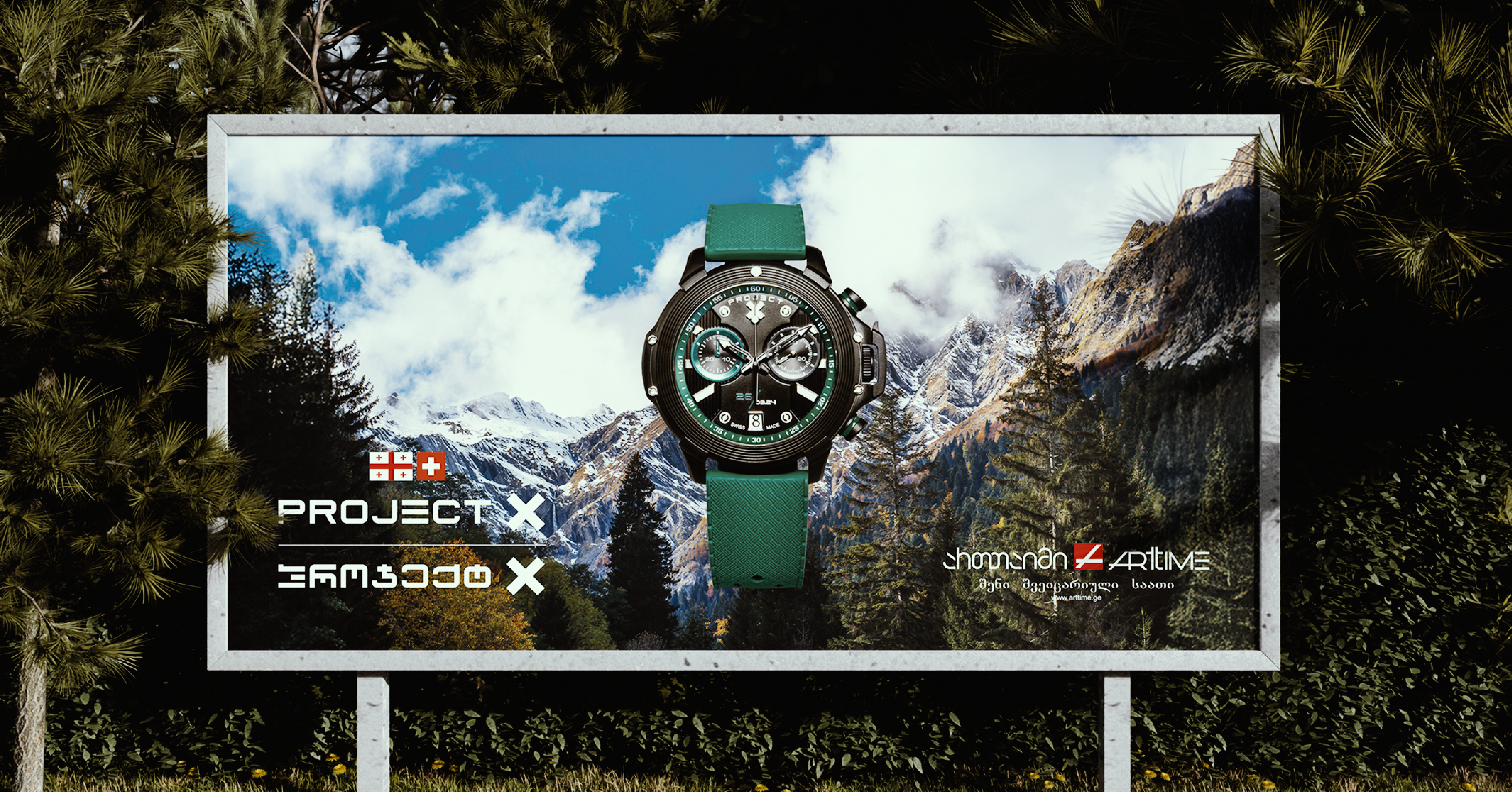
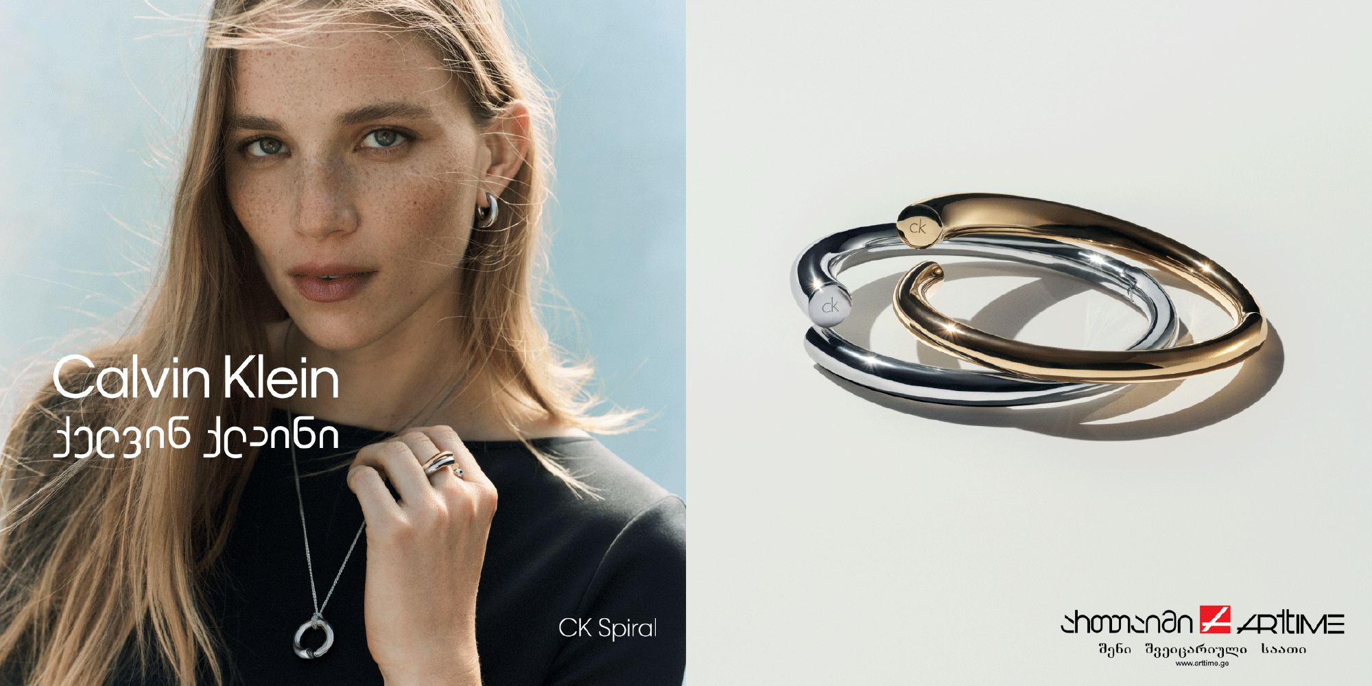
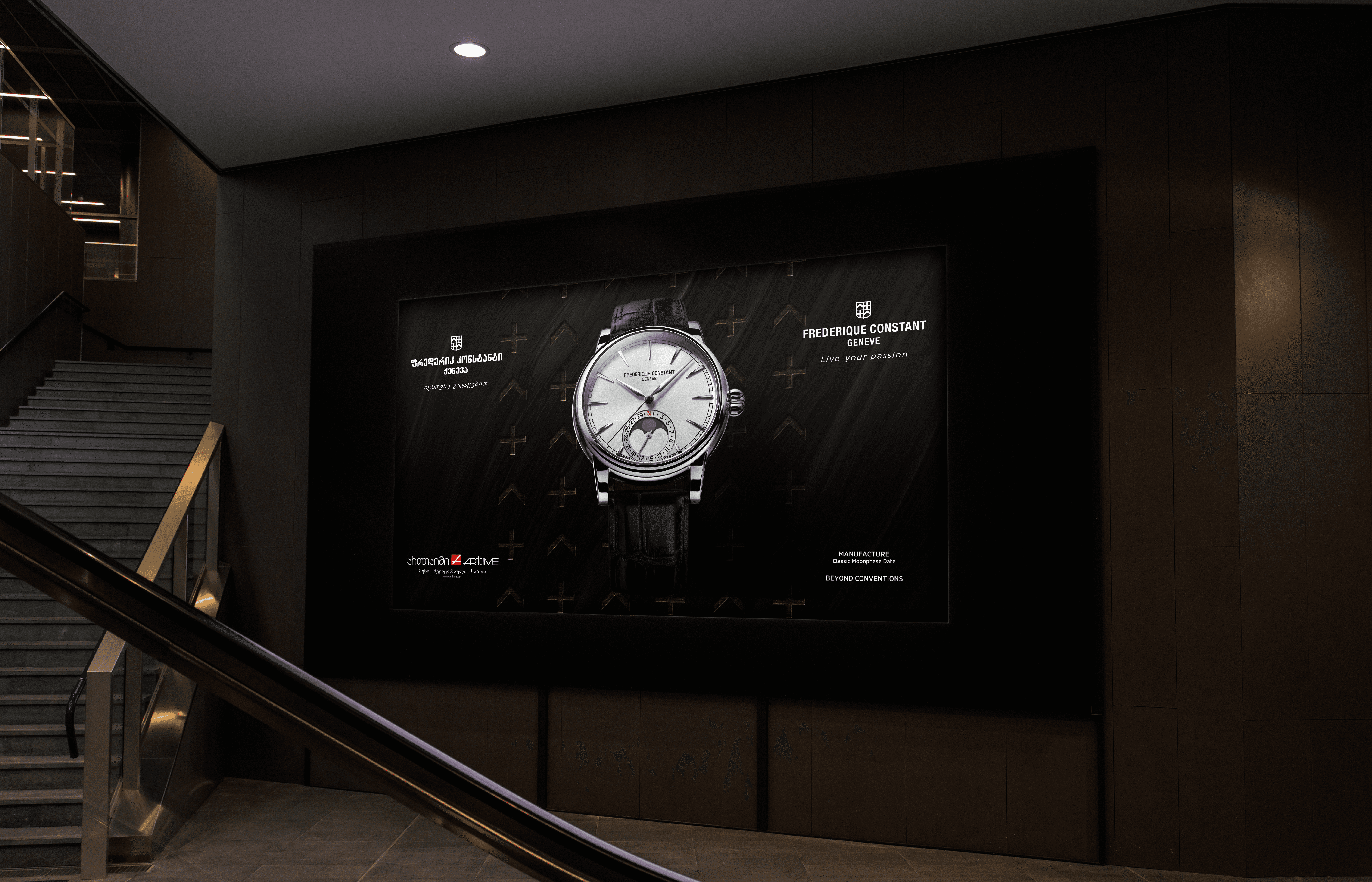
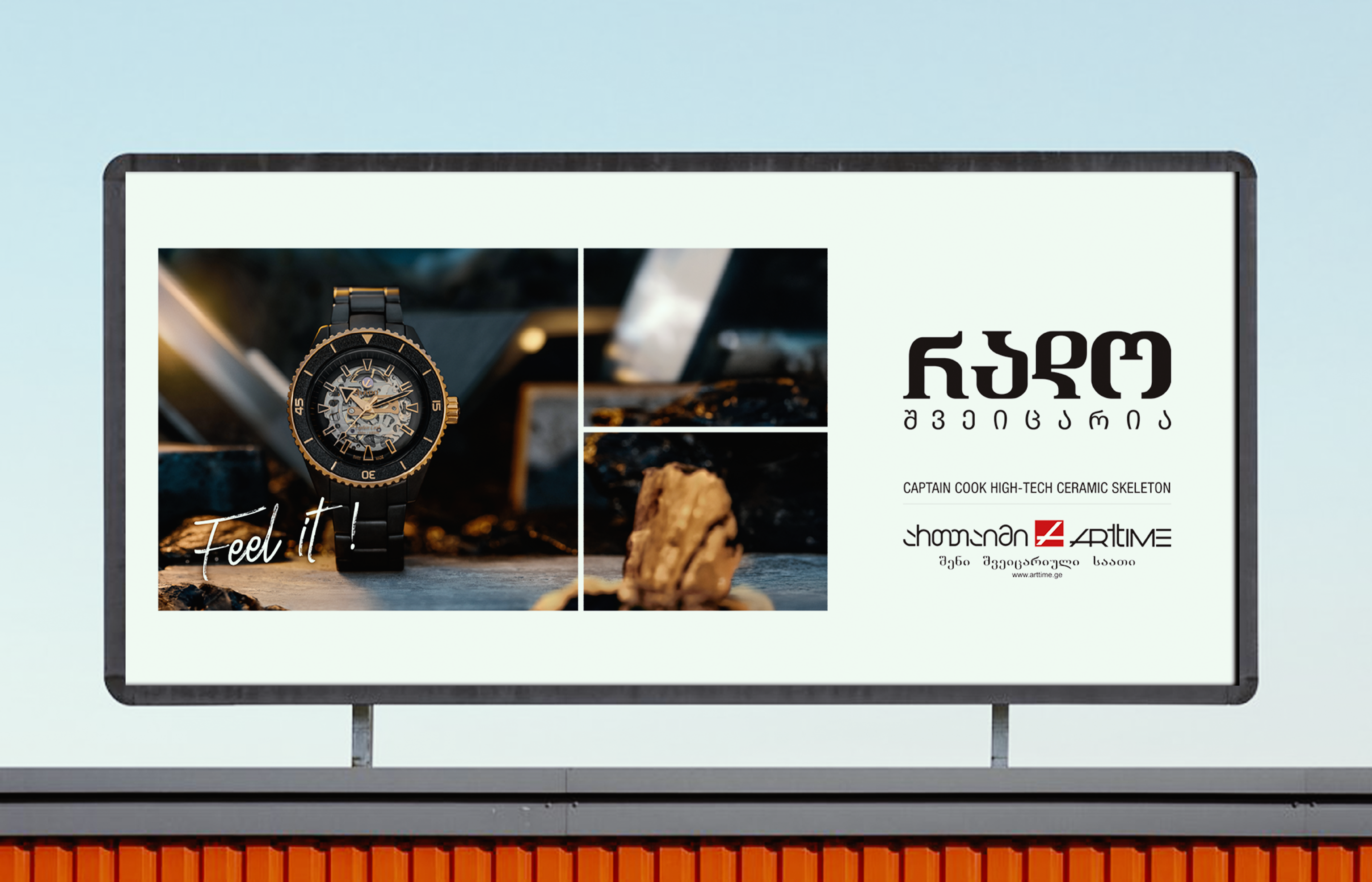
Extended the brand identity into offline advertising formats including billboards, banners, lightboxes, in-store branding, and retail packaging
Optimized all Arttime store locations on Google My Business with structured listings, accurate business information, and branded imagery to strengthen local search visibility
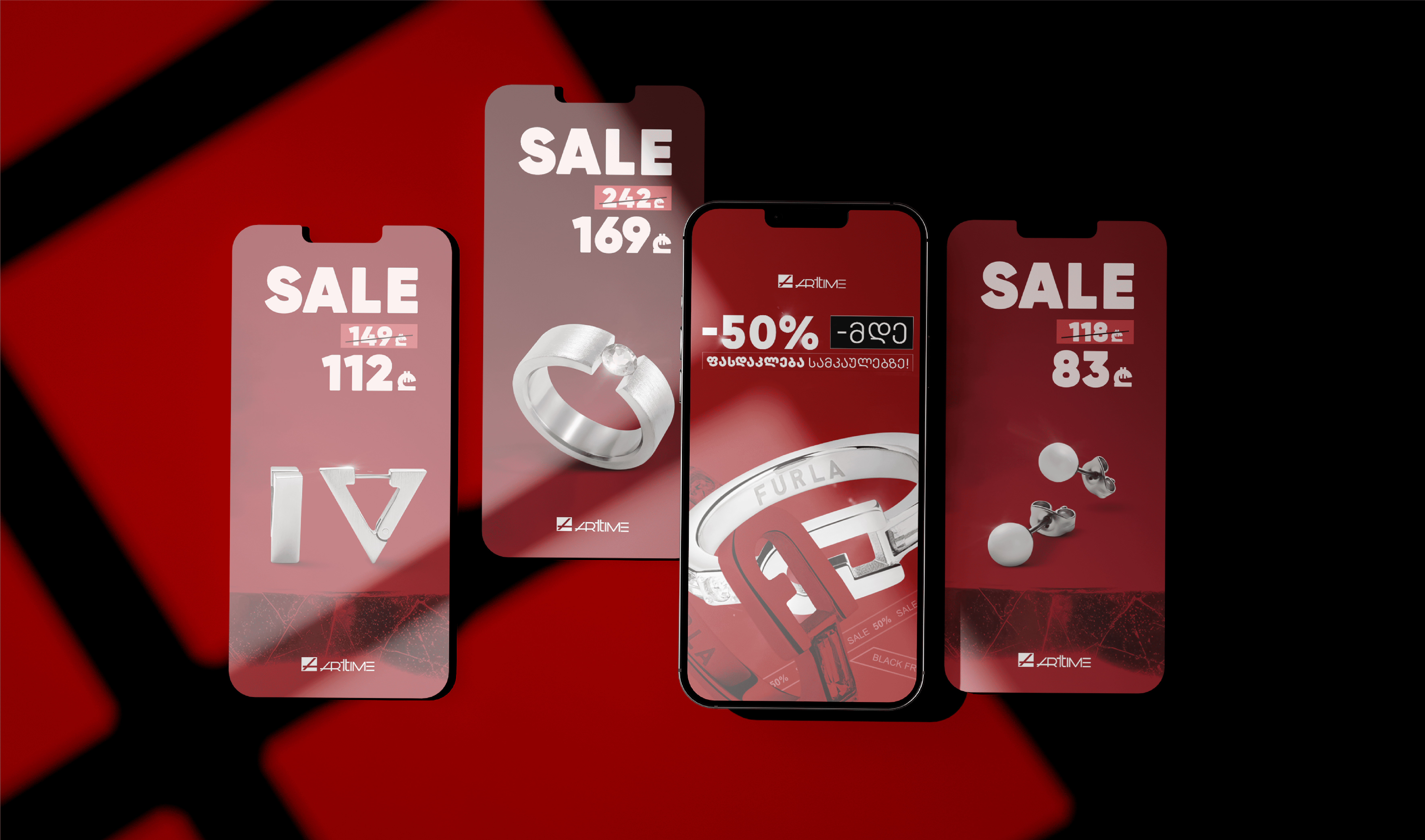
Provided ongoing advertising strategy support to align paid media efforts with seasonal product launches and brand partnership announcements

EXECUTION
The brandbook served as the first major deliverable and the governing document for everything that followed. It codified Arttime’s visual language – logo usage, color system, typography hierarchy, photography direction, and tone guidelines – into a reference that ensured consistency across every touchpoint, whether a retail space or a billboard on a Tbilisi highway.
Brand application spanned both digital infrastructure and physical formats over the course of the partnership:
Deliverable | Description |
Brandbook | Complete identity manual covering logo usage, color palette, typography, photography direction, tone of voice, and application examples across digital and print |
Offline advertising | Billboard designs, street banners, lightbox creatives, and in-store branding materials applied across Arttime’s retail locations |
Print collateral | Branded shopping bags, product boxes, business cards, and promotional materials produced to brandbook specifications |
Google My Business | Structured and optimized listings for all store locations with consistent branding, accurate information, and updated photography |
Advertising strategy | Ongoing strategic support for paid media campaigns aligned with seasonal product launches, new brand partnerships, and holiday promotions |
The four-year duration of the partnership allowed the visual system to mature gradually rather than through a single launch. The brandbook evolved from a static document into a living reference, continuously refined to reflect real-world application across advertising, retail, and customer touchpoints.

KEY INSIGHT
Consistency across physical and digital brand touchpoints proved critical in reinforcing perceived product value, demonstrating that luxury positioning depends as much on communication systems as on the product itself.
